Tuesday, 21 April 2009
Deconstruction
What's the difference between commodities and objects ?
They seems identical yet somehow quite different.
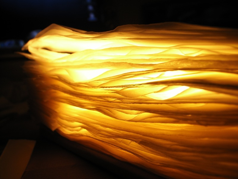
In this project, a pattern printed on the surface of a compressed block t-shirt as part of the packaging.
During the process of transforming a commodity into an object (i.e., opening the packaging) the pattern converted into a new visual impression.
You'll be surprised to see the distorted image now becomes part of your outfit.
Saturday, 31 January 2009
Products & Website
There's not too many description about their shop, their approaches to merchandising on the NPG website. But there's something I regarded has great potential to explore.
Portrait Printer:
They provide this print-on-demand service in the shop where you can chose from over 60,000 images in their archive collection and get a digital print. This service is also available online. There's a similar service called Collectors' Reproductions which provides high-quality reproductions for collectors.
Portrait Explorer:
Another interesting thing is the Portrait Explorer located on the National Portrait Gallery's ground floor mezzanine, which provides visitors with touchscreen access to over 30,000 sitters and artists and 65,000 portraits in the Gallery's Collections.
I find there's great potential and possibility within the two exciting elements yet to be explored. One thing is about the media, those great portrait can be printed on different format rather than just poster which will easily become an obsolete object at home; the printing process could even involves some innovations rather than just simply reproduction. Another thing is the wonderful digital database could be designed to form a better gallery experience. Imagine the Portrait Explorer as not just a education center but a more integrated part of the whole exhibition and the shop. In this way visitors can GET things they really favor during the visiting process and get the object when they leave the gallery.
The last part I'll list some of the products from the gallery shop. ( you can also find them in the online shop ) They are all categorized by the four types I mentioned in last post.
Special Collection Products:
the special exhibition is Annie Leibovitz : A Photographer's Life, 1990-2005
Red and grey scarf £35
Quote from the online shop "It captures the colours associated with the current exhibition at the National Portrait Gallery."
Logo Type Products:
National Portrait Gallery black canvas bag with red handle £5.00
Gallery-Related Products:
Grey quill dipping pen £3.83
Yvonne Gregory coin purse £7.50
Dame Ellen Terry compact mirror £3.50
Kings & Queens mint chocolates £3.95
Famous Faces Playing Cards £6.80
Adelaide party mask £1.91
Magnet Frame Charles I £5.82
Taylor Wessing Photographic Portrait Prize 2008 poster £4.90
Replica life mask of John Keats £57.74
A replica of the John Keats life mask held in our collection, hand cast in plaster, and coloured to simulate the original. The complete head is 300 mm high and stands on a small base.
Other Products:
Table top postcard display £18.99
Small black journal £14.69
The London Mug £9.50
King Henry VIII Magnetic Armour Dress-Up Set £10.75
Tuesday, 27 January 2009
New Directions
This calculator is designed for the MUJI competition. And I found in a way it illustrates my interest and the whole Crisis project direction quite well. The main concept of this project is based on the observation of how most people use calculator. It's quite common we need to calculator something like :
17 x 3 + 29 x 4 = ?
We do the first 17 x 3 and get the answer 51; the next step is to calculator 29 x 4. The standard way is use the function key "M+" which put your previous result into the memory. Yet only few people realize how to use M+. What most people will do is find a paper and note down the number 51, then do the 29 x 4. The reason we do not use M+ is because the number we put into the memory section is not visible. You do not trust something you can't see and it's difficult to learn a function without a feedback.
Based on all these observation, I visualize the memory section on the calculator. Or you can say I transform the behavior - people noting down numbers near a calculator - into a function on the calculator.
The reason makes this project link to the Crisis Project is the same consideration about the relationship between human and machines - or more precisely, digital machines. The relationship between human and digital objects is always not as stable as other objects. One reason is the technical issue of a digital objects often draws too much attention from the designer/engineer. And during the internet era the way people use digital products becomes even more unpredictable. And that's the reason why people always complain about having difficulty communicating with their machines or even be afraid of them.
In short, the modified direction of Crisis Project in this term becomes "the Perceptions of Digital Products" where I'll take a deeper look at the relationship between objects, human and digital technology. One of the issue is that when we apply a new technology which indicates a new way of living, we have to give up something from the past. There's always a conflict in this process. Which should stay? Which should go? And there is no CORRECT answer for the questions. That why we designers should handle this issue more carefully.
The next step I'll try to map out different types of digital products and choose four types from them to start the research. This includes a deeper look about the behavior occurs within the whole relationship of human and machine. What's it's predecessor? How's the human behavior evolves? Is there any classic products in this category? And then evaluate what's the new or ignored relationship need to be further emphasized and then develop a design from that point.
Saturday, 24 January 2009
DSI - National Portrait Gallery Shop : first view
A short list about the first view of National Portrait Gallery - both the exhibition and the shop. Here we start from the exhibition. They arrange the whole display through time-line - from the old times to modern age. The exhibition spaces and the form of portrait varies through different period of time - modern space with photographic portrait in modern age and classic decoration matches the traditional sophisticated oil painting portrait. It's quite interesting to see how format of art changes through time and how different concept of portrait emerges. The way they make these portrait not just one after another "painting" is very nice - they bundle these portrait with history carefully. You can regard it as a special point of view to review history. They have great database in the gallery which visitors could enter without a problem, and the digitalization of their collection gives more potential to view these pieces. One thing to mention, the modern age exhibition on the ground floor seems to be short-term display, maybe this reflects the fast-changing essence of "modern" and present continuous tense "history."
Let's move on to the shop, bookshop and cafe. Cafe and bookshop located on the basement and the grow together in a very elegant way. The best thing of the basement is both the bookshop and cafe fit the building very well, you can see the conversation between old and new structure of the space. Yet the gallery shop on the ground floor failed to do that - it's just a boring space. The stock lots of books in the shop - I think far more than ordinary museum shop. But this time I did not note too much about this book shop, I'll do it next time.
This is the nice bookshop space, you can see there's some cafe seats inside the bookshop.
And this is the boring gallery shop.
Some quick notes about the products in the shop. I classify the products into four different categories :
。Logo Type : the most boring one, some cheap stuff like pencil or mug printing their logo. (the name or the illustration of gallery facade)
。Gallery-Related:I think they produced there products which fits the theme of gallery better. Postcard and poster exhibit the most in this category. There are also some scarf of tie printing some portrait. I think this category has a lot of potential to explore.
。Special Collection Products:the current special collection is Annie Leibovitz and they put some products relate to this exhibition - her portfolio, special designed t-shirt or scarf. Products in this category are more sophisticated with higher price and better quality, but there still lack a sense of innovation. For example, the t-shirt is just a white t-shirt printing a illustration as a camera hanging on the neck, which appears in many fashion brands already. ( if not mistaken, I think Marten Margiela did the first piece )
。Others:some other products from science toy to jewelry. I don't think these products fit the gallery well, but maybe they sell well, we'll see.
Overall the shop is not so interesting as I thought. The only thing catch my eye is this machine show above : you can select the portrait you like in the gallery and print the poster on demand. Since they have great digitalized database there's a lot of potential to play with the system in the shop. I think this print-on-demand or produce-on-demand shopping can give a novel and interesting museum experience.
Next post will focus on how their website describe and sell their products.
Friday, 23 January 2009
Revisit Projects From Last Term
Let's go through a simple review of my projects from last term. Here it is not about introduce the projects again, which you can find in the portfolio site, but focus on what happened and how one project relate to the others. The starting point is a one week project - mini Crisis, where I manipulate the physical experience while surfing the internet by adding small blocks to the keyboard. The manifesto behind this small project is about how human mind adapts to the new virtual environment in 21th century.
Yet later on each projects seems to go parallel rather than further developed from previous projects. I think a quick a review should help what happened.
mini Crisis
As mentioned above, this project concentrates on you position yourself in the physical world while your mind is surfing in the virtual world. The approach is creating a different surface between physical and virtual world. I have to admit this issue contains much more influential elements and manipulate the "surface" only touches the tip of the iceberg. Yet it's a good start for a large scale project.
One thing to notice is my INTENSION in this project. I tend to pull back the mind from virtual world. Maybe it's because I always get lost in that world...
Connection ( Mail System )
Here I try to identify the similarity and difference between mail and e-mail system. The discussion point is about the MEDIA - how media effects the message ? And then I raise a question - "what if mail can and e-mail can speak to each other ?" - and try to find a poetic solution. The "get lost in the virtual world" issue vanishes here but the way we interpret "surface" still hold a relationship to previous project.
Crisis Film
This short film visualize our "new" behaviors in the virtual world and somehow connects to the "get lost" issue. Similar to the mini Crisis, in this film I unintentionally critique the way information become fragmentary.
Breathing Lamp
The initial intention of this lamp is to create a new form of communication - passive communication. Yet in the end the organic behavior of an objects draws more attention. In this point of view the result connects to neither the "surface" nor the "get lost" issue. We may regards it's more about the relationship between human and object (digital objects maybe.) And the way technology hidden within the more "human" surface is also my interests - I call it poetic technology, and this may further develop into the brief of this term.
In Between the Books
This projects explores the possibility of book as a media or an objects and I creates different versions of book with holes within each pages. I quite like these books at the level of objects, yet it goes a little bit far away from all the possible themes I'm doing.
A quick conclusion for this short review, I set myself a very large scale issue : "how human mind adapts to the new virtual environment in 21th century ?" Maybe the scale exceed the scope design could handle, it could be in the territory of sociology or psychology. Since my goal is more design-oriented rather than research-oriented, I should re-organize my brief and position myself in a more specific place to cut in this big issue.
Monday, 19 January 2009
Crisis Shop - hurried clock
Just a simple visualization of the 2 initial ideas of the merchandises for Crisis Shop - digital and analog version of crisis clock. The next step could be figure out a way to break the typologies of a "clock."
Crisis Clock no. 2
This digital clock provides three different perspectives of how time flows. The Triangular Prism shape allows you flipping the clock into different surface, which demonstrate the flowing of time differently - display as a stop watch, fade-in with the exact time every couple seconds, or the normal mode.
Crisis Clock no.1
The function of a sweep hand of a clock is to give the impression of time flows. Here the crisis clock push this sense to the limits - where the sweep hand travels a full circle every second.
Friday, 16 January 2009
DSI - National Portrait Gallery Website
Culture Shopk
This is what we got parallel to the Crisis Project & the Crisis Shop during the 4 weeks. We need to DSI - Design Scene Investigation - the products in a shop of a particular museum, find out the core subject matter, review their approach to merchandise, and do as many researches as possible.
The second step is finding if there's any alternative to all these results. Develop a critical evaluation and offer opportunities for a new type of products. What I got is Nation Portrait Gallery. The first thing to do is take a look at their website and online shop :
National Portrait Gallery
Online Shop
I'll go there and take a look tomorrow.
Subscribe to:
Posts (Atom)